4th day.
What next? Some thoughts about a potential concept…
I’ve enjoyed trying out different things with Nodebox, though mostly the results have been completely accidental. Because of this I’ve found it difficult to continue with these experiments much further. At the moment I’d like to do something connected to my “ordinary” book typography related work (more conservative in nature), but also to look for something that is visually interesting, somewhat experimental, and most importantly characteristic of the tool being used (nodebox or computers in general).
I came to think of ornaments that are used in traditional book typography: growing plants, knot-like forms, calligraphic/geometric patterns things that are at the same time rational, geometric, disciplined, but also unpredictable, spontaneous, exuberant, imaginative & associative (letters and empty space suggest different ornamental forms). Ornaments should be considered the last elements in the hierarchy of all the visual elements of books: 1st is the empty page and its proportions, 2ndly the primary mass of text, 3rd headlines, drop caps etc. and then ornament which is partly defined by what exists already.
My concept at the moment is to do “generative” ornaments, as imitation of traditional forms of ornament, at the same time maybe increasing complexity by layering groups of forms (“modules”) or by repetition of forms in big numbers or by using self-referencing forms. (Perhaps also some randomness?)
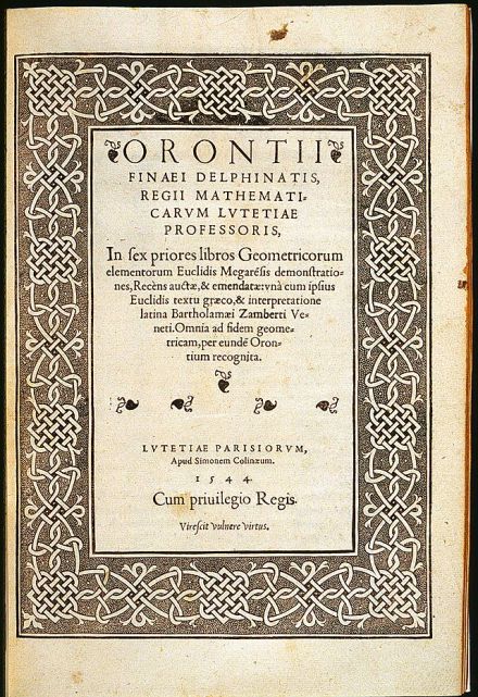
I collected a few historical & modern examples… A title page by Simon de Colines, 16th c.
Some examples of 20th century interpretations of traditional ornamental borders (made of “knots”):
Cover/title page of a monograph of Giovanni Mardersteig’s work
Generative book covers (for print-on-demand books):

