FINAL DAY: And yet... it works!
There has been a lot of wailing and gnashing of the teeth lately. I haven’t been very active on the blog, as well. Wednesday and thursday swooped by with me sitting in front of my computer noding and sweating code as hard as I could. In the end I managed to piece together my work (with non-replaceable help from Tom and everyone) , and it isn’t half bad. Yay!
Before I present everything, I would like to rewind a little and explain why I chose Engrish as a base for work.
As a graphic designer I think that the message we want to convey is the most important thing in our work. Thus, if there is text, it should work together with the visuals, preferably adding something to that message. If I were to design something with, for example, Arabic text I’d like to find out what does the overall design say to someone who understands Arabic language and culture. I think it would be embarrassing not to do so. Especially when designing mundane everyday things, like advertisements or package designs, we need to be as certain as we can be of the message those designs hold, as lot of people can interpret them in many ways. Ambiguity is not a desirable factor in every day graphic design.
This is why I’m amazed of the amount Japanese graphic designs that use English, with the outcome often looking as silly or even uncomprehensible. If the Japanese can’t use English properly, why do they put it in their designs so much? Even big and credible companies do it a lot in Japan. The faq in Engrish dot com has a good answer to this question:
Most of the Engrish found on Engrish.com is not an attempt to communicate - English is used as a design element in Japanese products and advertising to give them a modern look and feel (or just to look cool). There is often no attempt to try to get it right, nor do the vast majority of the Japanese population (= consumers) ever attempt to read the English design element in question.
So the Japanese, who you would presume to be otherwise so careful in what they say, aren’t so particulate when it comes to English in design. After thinking about it, it makes a lot of sense, though. Engrish.com had more to say on this:
Quite often it is easier to come up with English names than Japanese for a particular product. New products are brought to the marketplace in Japan more than anywhere else in the world and Japanese words and slogans quickly get used up. Japanese graphic designers will often tell you that English is widespread because the Japanese writing script (or scripts) limits their creativity - there are only so many ways to display their language, and only so many different types of fonts to use.
I find this extremely fascinating. In a way, the Japanese are looking at these products like a pieces of abstract art. To the major Japanese public, the western type forms in these products have no meaning in content, only as forms or design elements. On the other hand, if you understand English and especially it's cultural connotations, there is a good chance that these will look funny to you. In today's visually over-saturated world, various brands compete in trying to produce striking graphics to influence the consumers. But free trade and competition in today's global economy has made many of the products essentially the same in content. In some cases, the only difference between those products is the packaging. So why one would be better than another?
In a way, these Japanese graphic designs are creating a parody of the whole industry. Perhaps through them, we can see that in the end it doesn't actually make any difference what's printed on these products. Furthermore, we might notice that the ideas and messages the commercial graphic designs are trying to convey are just meaningless gibberish, not to be noted. These designs work like a big disinformation graphics machine, continuously producing visual messages that lack meaning, and as such, are not relevant.
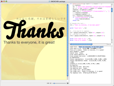
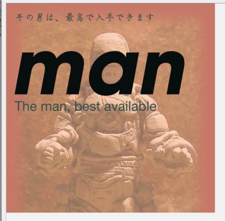
The Engricher is an attempt to explore this thought. It generates a piece of visual identity for a given concept, based on how the internet treats that concept with some fundamentals of Engrish applied. After you have typed in text in English, The Engricher translates the text to Japanese, then back to english. It then chooses the word from that sentence which is used for the headline or the logotype, if you will. That same word is used for a search term to retrieve information from the web. Using that word, it searches through kuler for color values and through flickr for images that users have tag with that word. Next, it fills the background of the visual output with that colour and pics a complement color (yet slightly darker) for the color of the texts (so that they would be more visible). Then it chooses the typeface for the headline and the "slogan" texts from a list of fonts I manually created. Finally, it draws two visual elements: a swooshy type of line path horizontally from left to right, and an circle, which is randomly placed at the screen.
The Engricher tends to gives better results if the inputted text is longer, and doesn't quite work for only a one word.
So, it is finished for now and it works. I still think I chose too complicated of an idea, though: there are lot of stuff that still could be explored and experimented with it and it could work better or produce more interesting results. Plus, I really had a hard time doing it, and I needed a lot of help from Frederik and the gang. I should have realized: I’m not a coder and instead of trying play one I could have just done something that visually interest me but isn’t so complicated. Still, I think I deserve a pat on the back. I think I really came a long way in this course and I want to continue experimenting with NodeBox even once this course is over when I’m finally starting to get the hang of it. Last night, while doing my presentation with InDesign, I pressed command+r instead of enter when I wanted to edit the measurements of a text frame! Yikes :D I hope the version 2 comes out soon!
Thank you, everyone! This has been one of the hardest school projects but also one of the most rewarding. It was real fun having lunch and hanging around in the class with everyone. Everyone made really interesting blog posts too. During the workshopsI even read them in the evenings at home. I hope I have a chance to some way participate in this workshop again someday.


