dynamic timeline Journey Map
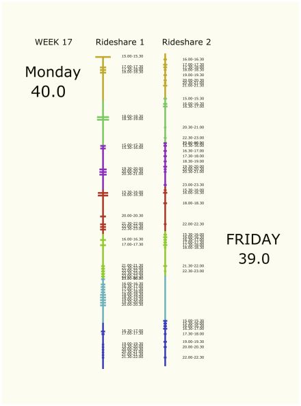
The concept is to develop a journey map from excel data, that maps individual schedules and compare them to each other.
The map should be able to show the different time segments, ie, hours, days or weeks, distributed along its length. There should be horizontal lines along the length that give some idea about the tension generated on those parts of the schedule.
2 line map laid next to each other should be able to give a quick overview of clashing and busy vs flexible times of the 2 individuals.
Further, there should be possibility to bring out some of the text data at some ‘touchpoints’ along the line.
So far it looks like this, with data from 2 excel sheets.
<fieldset class="zemanta-related"><legend class="zemanta-related-title">Related articles</legend><ul class="zemanta-article-ul"><li class="zemanta-article-ul-li">MapStory - Wikipedia Way of Telling Stories on Maps and Timelines (classroom-aid.com)</li><li class="zemanta-article-ul-li">How to visualize in a good way? (learningwellsouth.wordpress.com)</li></ul></fieldset>


