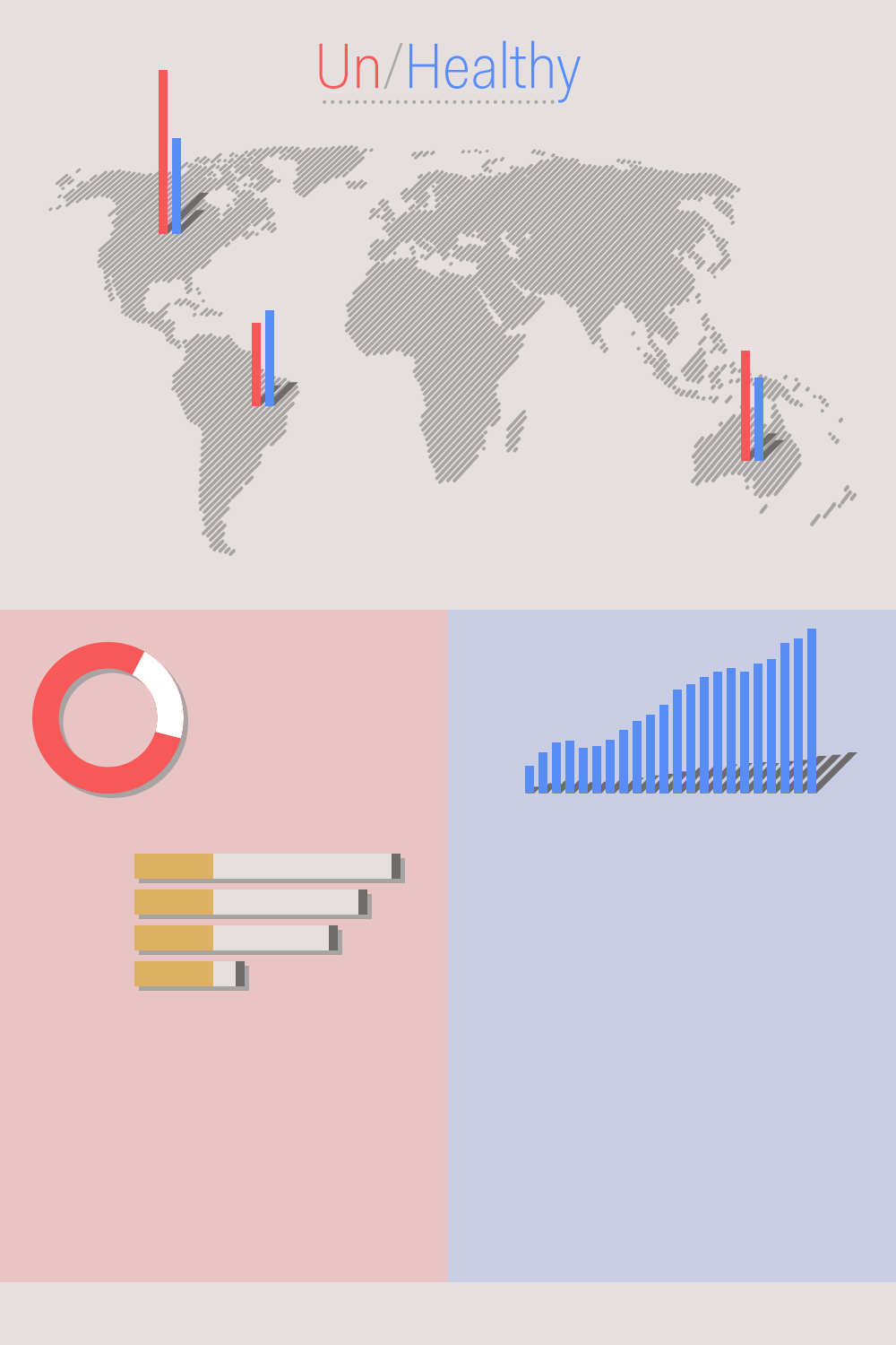
Un/Healthy
I would like to produce an infographic that juxtaposes healthy and unhealthy habits in daily life. The infographic would contain graphs and illustrations, playfully separated into two parts: healthy and unhealthy. Information placed in the middle would compare the two. At the top would be a world map displaying the distribution of some central habits (per capita) for different countries.
Healthy:
Amount of exercise per week
Percentage of vegetables in meals
Happiness index
Unhealthy:
Obesity
Cigarette-smoking
Hours in a day watching TV
UPDATE #2:
The final version for the workshop is done. It displays the Happiness index and BMI for the top 20 countries in both categories. These values are also laid out on the globe map to show some correlation. In addition, the cigarette chart describes the top 10 countries with the most smokers and the chart on the right shows the average life expectancy for the top 10 countries in that category.
In the future: I'm going to add other graphs that correspond to healthy and unhealthy lifestyles, such as food consumption, sedentariness, television-viewing, exercise, etc.
UPDATE #1:
The base visual elements have been built, the main data collected and preliminary bar charts put in.