Day 3 (Pre-production day)
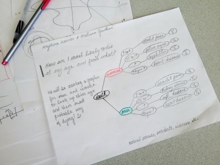
###After learning more about data visualisation on Nodebox, we could think clearer about how our approach of ‘How am I most likely to die?’ would be.
Our first idea would have been to create a sort of lifeline per sex to illustrate the percentages of the most probable causes of death. Once we realised that the information was falsely interpreted, we decided to replace this ‘lifeline’ like image by different strokes, representing the percentage of the deaths probability.
Now that we have sorted our main idea out, the next step will be putting all of our ideas into Nodebox!
-Kissies!


