Day n°3: Benjamin, Jesse, Louis
Until today we still tried different ways to figure out how we are going to show on our poster the data that we found about catastrophic events in Canada We finally came up with a poster separated in two main graphics. The first one on the left is going to be a timeline separated in five according to the five categories that we have. Each event is categorise and will appear on the timeline according to their length in time. So more an event was long in time, the more presence it will have on the time line.
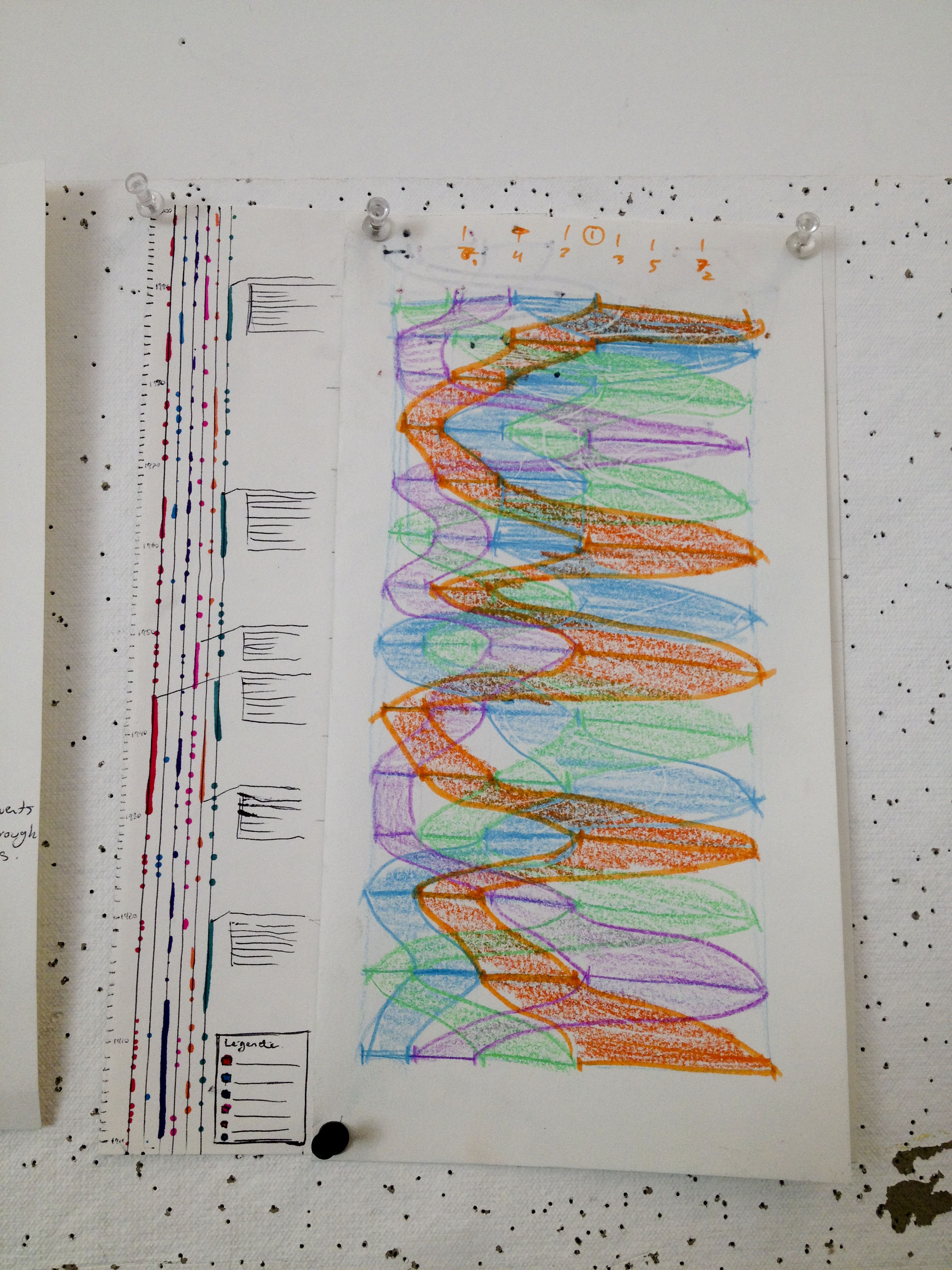
The second part is a stream chart separated in five according to the categories explaining by the weight of each stream how much people were affected by the event (deaths, injuries and deported people). The flow is variating according to the amount of people affected for every decades (from 1900 to 2010). Also, there is a ranking notion about the information, so the category of event that as the biggest amount of people affected in the decade will be on the extreme right of the poster, the second will be next to it and so ever. Finally, the cost that the event cost to the country will variate the brightness or the saturation of the stream.
That’s where we are at the end of the third day of our workshop!