Day 4 (Melissa & Krystina)
#Well!
We change our minds a lot these days because we are trying to find a good way to represent the data.
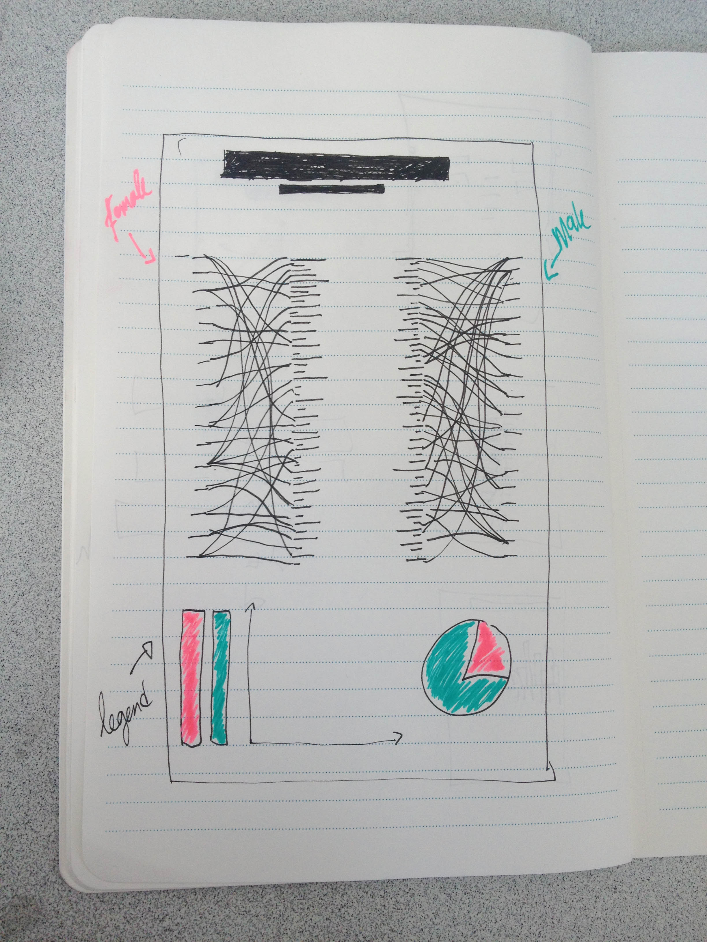
First, we had to change the graphics, because it presented false data errors. We decided to make two charts. One for women and one for man. In this way, the reading of the information will be much easier.
it’s gonna work!
In short, the causes of death are found on each side of the two diagrams are related to ages by sex.