Day 5 ! Final Stuff
So here we are, the last day of the workshop. We did a lot of fine tuning to make sure everything was aligned correctly. We were almost done at the end of day 4, but we found the way to spent the hole morning working on the final poster and print at exactly 1h30 (deadline). But we are very satisfied of the result and proud of all the work.
##So here’s a recap of our project.##
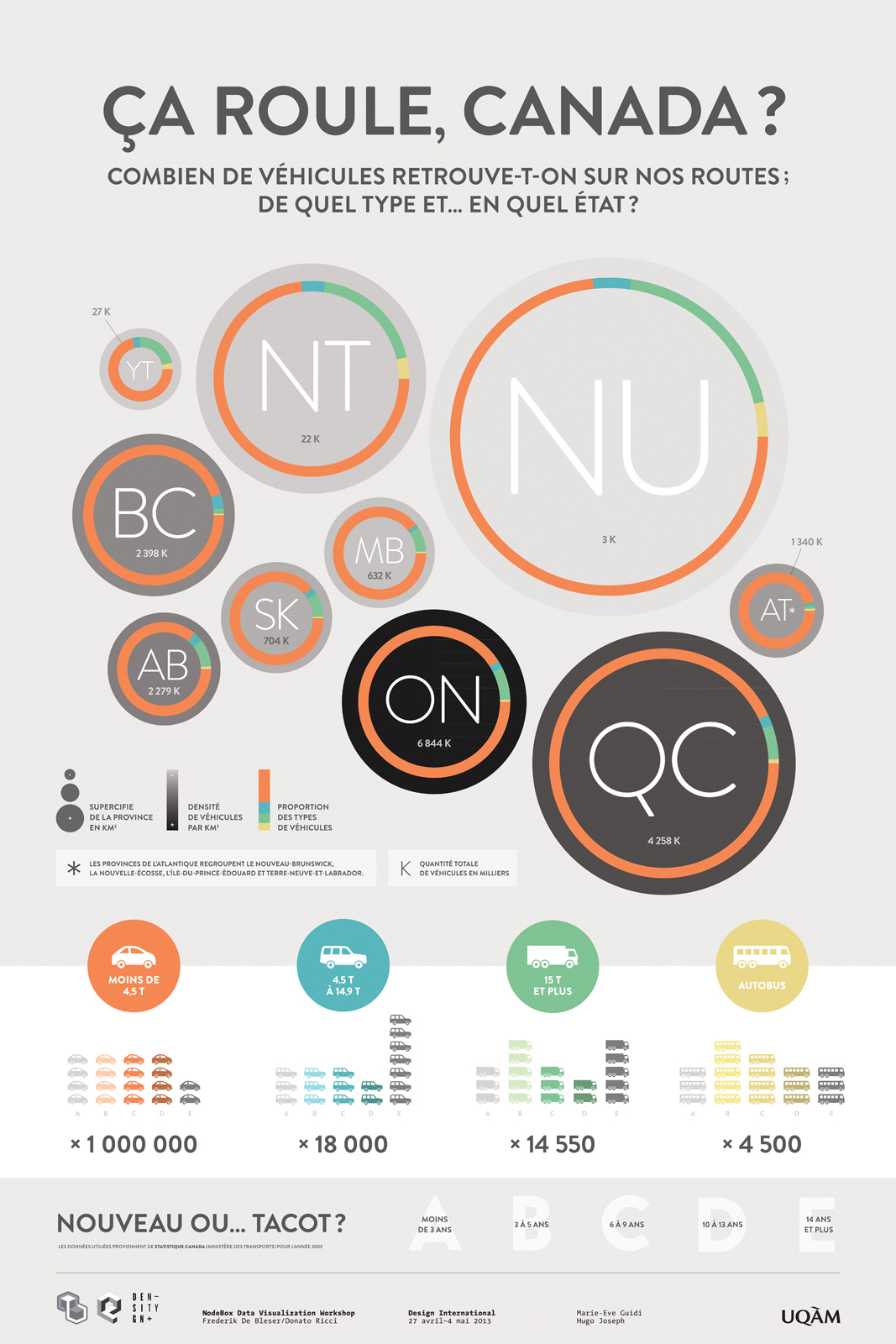
Our main question was about “How much place do cars take in Canada”. We wanted to draw the Canada’s portrait in terms of vehicles.
We thought it would be interesting to look at how much cars each province has and more precisely at the density of motor vehicles for each ones. We soon realized how impressive it was to see the density of provinces such as Nunavut (biggest province, but has the lower vehicles total) The opposite was also true (looking at the Ontario - relatively small-medium province, but has A LOT of cars). Then we looked at the different types of vehicles (passengers car - SUVs - Trucks - Buses). Again, the results were sometimes far from what we expected. For the second graphic, we wanted to illustrate how old are the cars (by type) on our roads. Surprisingly, we spent a lot of time trying to organize the visual. At the beginning, it was supposed to be an all vertical graphic. We thought that putting it more horizontal was a better option to expose the results and be able to compare them.
Our initial sketch showed a 3rd graphic, which is not included in the final poster. The main reason is because we didn’t estimate correctly the space the title and the main graphic would take, but also because there was some problems with what we wanted to represent and the datas. Since this last graphic was about driver’s gender (still by type of vehicles), the gap between the datas was HUGE. For example, looking at all the men driving passenger cars, we had a number that looks like 987654325689877459877… and looking at women driving trucks, we had data like 0,2… So… pretty hard to deal with, even more if with have a really restricted area. We just decided to focus on the final result instead of messing up with Nodebox, and probably get something that wouldn’t fit the small space we had left.
Of course, all the project is based on real data we found on the Open Data Canada website mainly in the Transport Minister’s section. The hole thing is based on the year 2003 because this year provided us the most useful (and complete) infos. So our poster is about cars in Canada, 10 years from now but it probably didn’t changed a lot… Except for the number of SUVs… maybe, who’s knows. This would be an interesting second poster to make. Anyway.
The workshop was extremely interesting and enriching. We learned a lot of stuff, of course about NodeBox, but also on how to deal with the data and how to select the right ones to work with. We are now aware that there’s is an infinity of possibilities to visually represent datas. NodeBox is an amazing software, you absolutely made us want to go further and explore more the this program.
Donato and Frederick : Thanks a lot for your time, your advices, all your knowledge and jokes. This week was a really nice one.
Hugo Joseph & Marie-Eve Guidi
<——– The final result of the poster and some close up (hope the pictures will upload correctly)