Visualisation of data
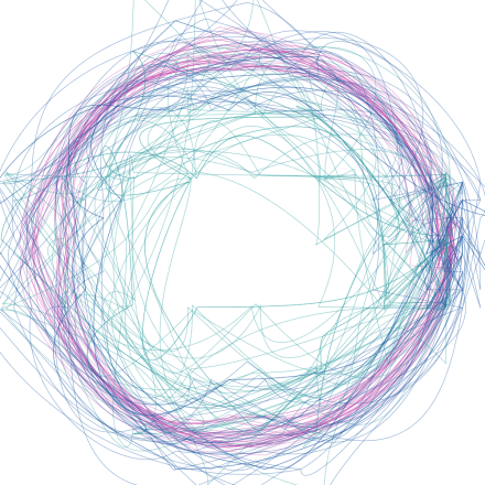
There is circle of fear. Each line shows a different fear.
I collected data from my friends top 5 fears for them. Then I choosed 10 and visulisated it. For example, fear “death” shows, how many people died in Lithuania last year.
